

I always liked the VU meters on the audio devices as kid. It was a visual representation of sound and there was some magic in it.
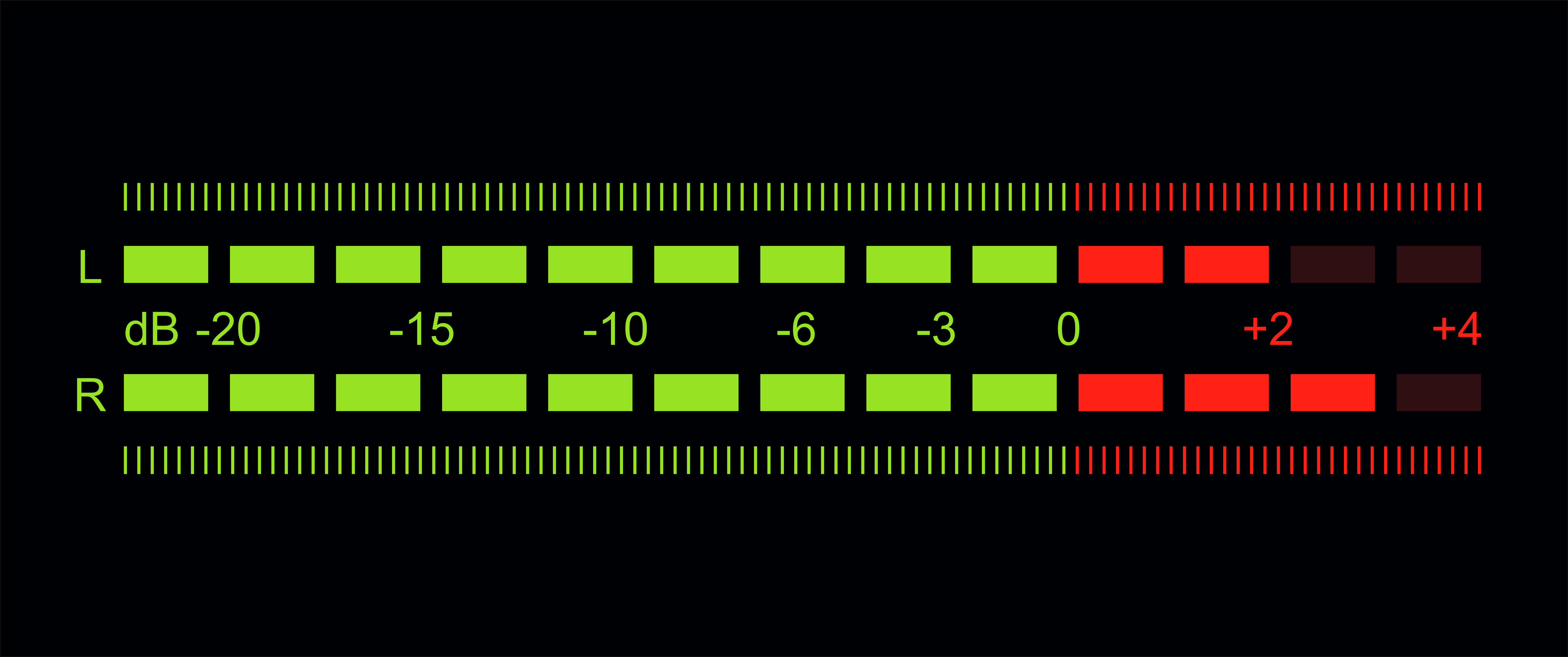
Now I can have a visual representation of % of daily ATR on my chart. Or any other “hot” gauge measurement.
It can be horizontal or vertical
its design/size can be customized
It can be buttons or just text
It can be customized to measure a percentage of anything (like your daily max loss, profit targets, stops etc.)
Here is how
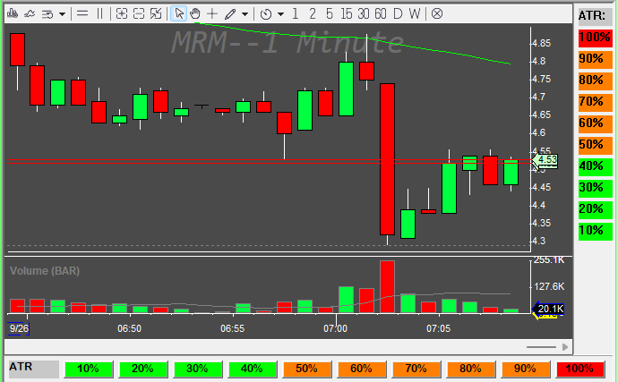
It assumes that the montage window is named MONTAGE1 window where you place the buttons is named MY1MIN (this can be any window), the daily chart window is named MYDAILY and the daily chart window contains the study named MYATR.
Create and number 11 Vertical buttons TBT1-TBT10 + the description button
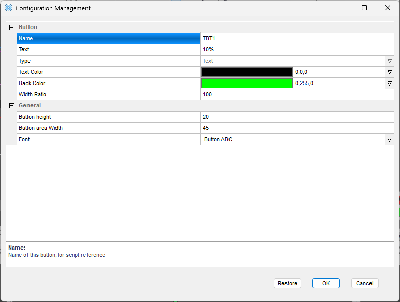
or 11 horizontal buttons TB1-TB10 + the description button
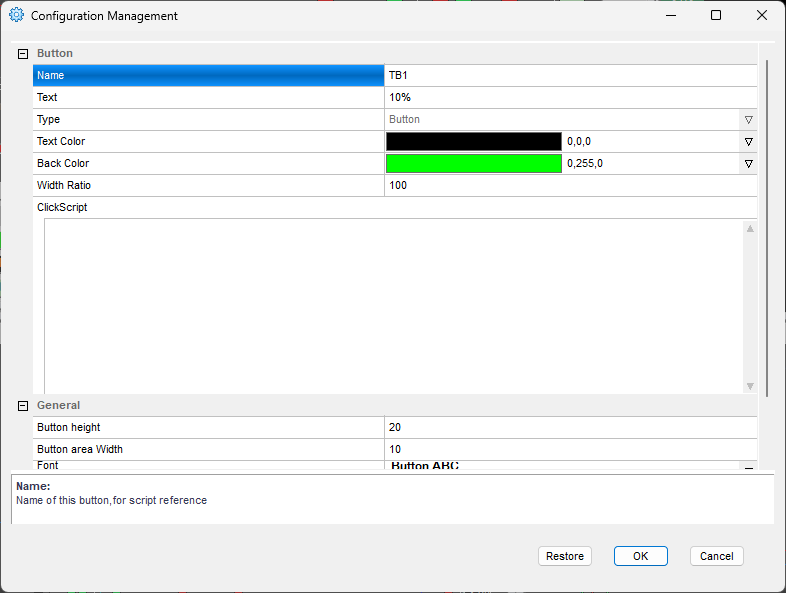
the colors of text and button do not matter and you can keep the defaults when you create them.
The beauty of the code doing all the magic is in its simplicity
Keep reading with a 7-day free trial
Subscribe to Peter’s Substack to keep reading this post and get 7 days of free access to the full post archives.